Overview
Improving the safety and quality of care offered to critically ill patients in neonatal and paediatric intensive care units.
For many years, there were challenges with paper based forms and charting in ICUs, which if resolved, would greatly improve patient safety and result in better clinical decision-making. The challenges included illegible handwriting, patient confidentiality, misplaced notes and limited accessibility of patient information.
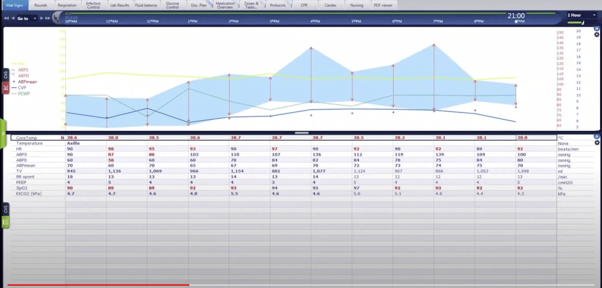
Sample image of what the system looks like. I no longer have access to the customised screens and designs.
February 2021 - Feb 2022
Main role was technical analyst, but I supported in user research. Role included ideating and mocking up potential solutions for stakeholders, testing concepts, and conducting user interviews.
Audience for this application was a wide range of hospital stuff including doctors, nurses, ward clerks and pharmacists.
Summary
There were many challenges to resolve for this application but this case study will focus on one: the medical menu. Because eRIC was a generic application that could be used in multiple hospitals globally, the pre-existing workflow to order and prescribe medications did not meet the Australian hospital safety standards. There needed to be another way to safely order and prescribe medications for critically ill young children and babies.
A page was created within the application which had multiple 'tabs' allowing a user to order medications based on different categories such as antibacterials, antivirals, bloods, IV fluids etc.
The page also allowed a user to search for medications if they didn't want to order from the most commonly prescribed list. Furthermore, safety measures were put in place by way of alerting doctors that they were prescribing repeat doses of strong medications
Understanding business requirements
My team and I worked with the product owners to understand how doctors would be thinking as they prescribed medications. We also sought to lock down the number of medications and products that could be ordered by this menu.
Keeping in line with the product constraints, I designed a couple of options for how the medical menu would look. As we got more feedback from internal stakeholders, the design was continuously updated to reflect the needs of the users.
Once the medical menu was at an MVP stage, we tested the prototype with doctors and gave them tasks to see if they used and navigated through the menu as we anticipated. We also went on-site to Nepean hospital during the first go-live to shadow and interview users as they interacted with eRIC during their everyday work.
It was very important to have a firm understanding of the context of the users that I was designing for. They were operating in a highly complex and challenging environment, where they had to make challenging clinical decisions with the data that was displayed to them. Having a good understanding of the potential risks and safety impacts allowed me to design the medical menu in such a way that would keep safety at top of mind for clinicians.
Alert fatigue was a very real issue. In a world where everything is beeping and buzzing, a small alert warning you that you had already prescribed a particular medication may be easily dismissed. Instead, design considerations were made to highlight this information in other parts of the decision making process. This prevented doctors from accidentally clicking past a warning and re-prescribing a medication.
User testing was humbling in the sense that the feature users liked and used the most was not the feature we hypothesised would be best. I learnt the importance of listening to users and crafting designs that would be useful and delightful for them. This helped us to allocate priority to the features that users actually desired to interact with most.
© Jennifer Kouch 2024 | UX Designer | jennifer.kouch888@gmail.com